Apple’s iPhone Pro series has not only pushed smartphone performance forward but also delivered iconic wallpapers that instantly became part of its identity. Each generation carried a visual style that reflected its time, sparking debates about which one truly stood out.
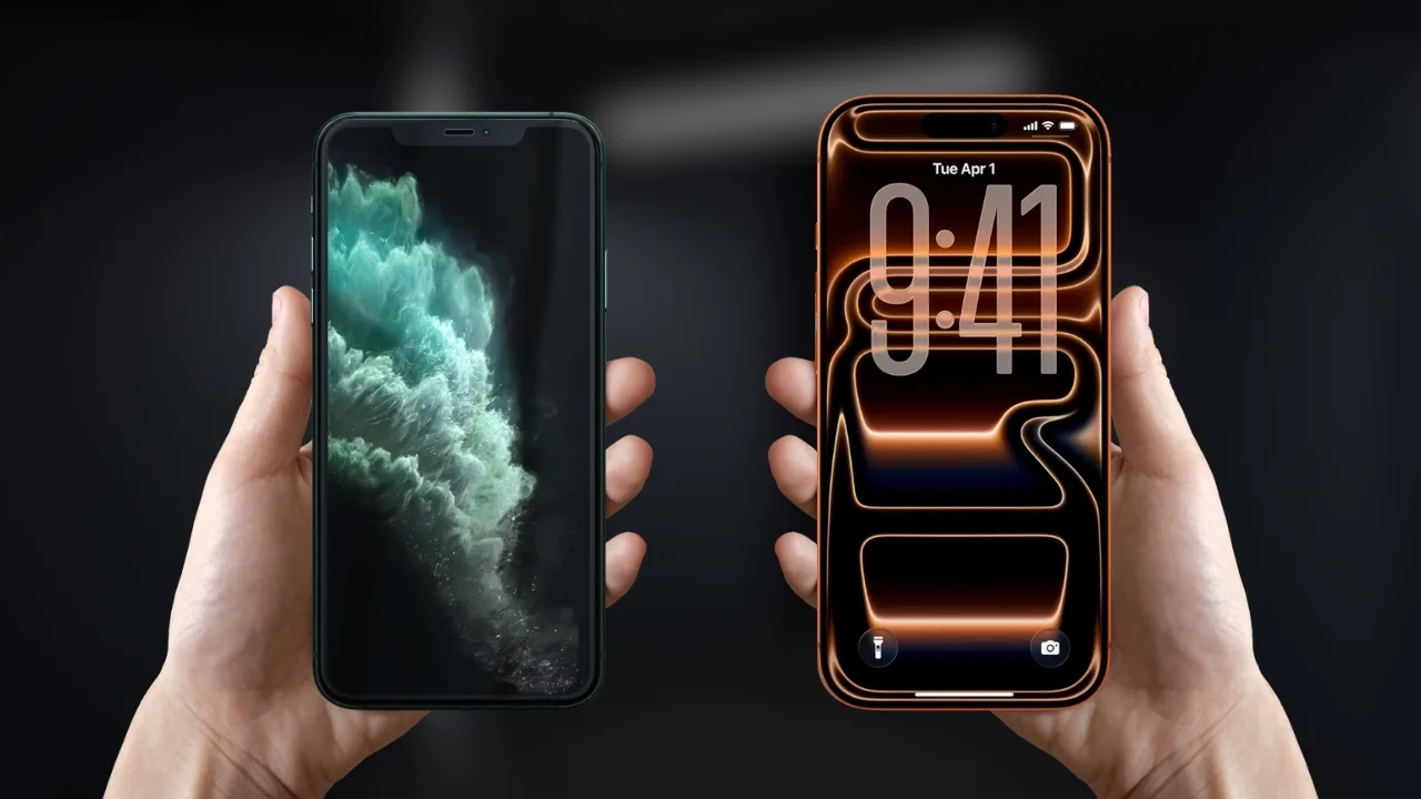
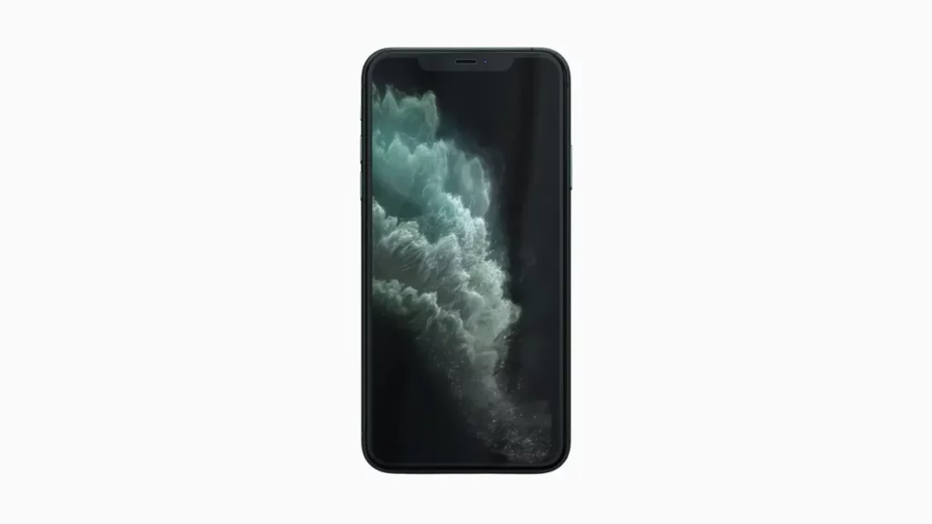
The iPhone 11 Pro launched with a swirling, storm-like wallpaper that felt dramatic and powerful. It perfectly matched the darker tone of the device, creating a sense of depth on the Super Retina XDR display that many users still appreciate today.
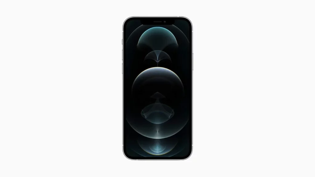
The iPhone 12 Pro introduced a more abstract approach. Its glowing, circular light patterns delivered a futuristic feel. Minimal yet striking, the design offered a clean look that resonated with users who preferred a modern aesthetic.
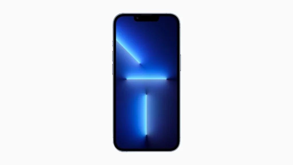
Apple’s iPhone 13 Pro went bolder with vibrant neon-style wallpapers. These backgrounds were bright, colorful, and sharp, showcasing the display’s capabilities. For many, this was the moment Apple leaned into a more playful and energetic style.
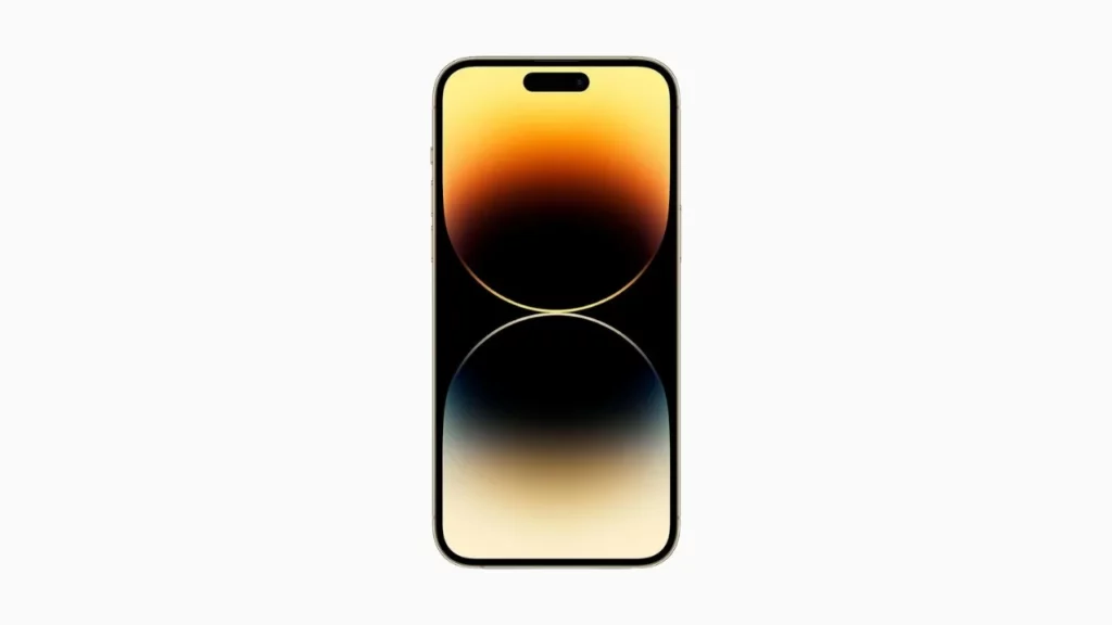
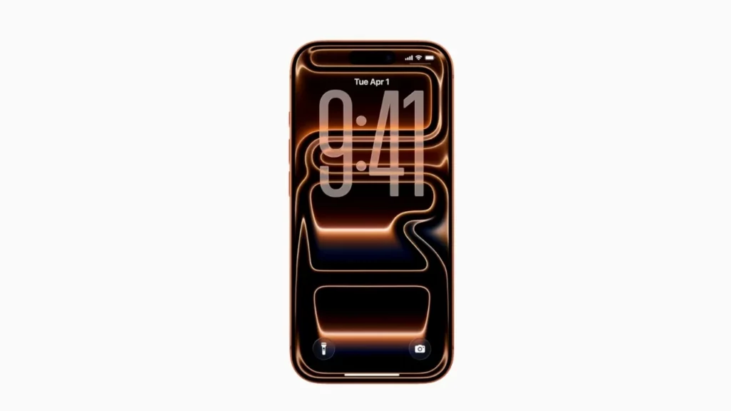
The iPhone 14 Pro became instantly recognizable thanks to its dynamic, gradient wallpapers that emphasized the new pill-shaped cutout. The glowing orbs gave the device a distinct identity, and many consider it one of Apple’s most visually polished designs.
The iPhone 15 Pro returned to simplicity with soft, flowing textures that looked elegant without being distracting. It was subtle yet refined, proving less can sometimes make a stronger impression.
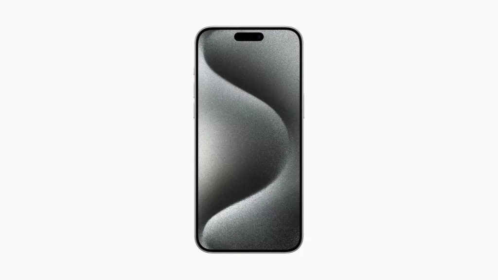
The iPhone 16 Pro expanded on abstract curves with smooth, metallic-like reflections that looked premium on the larger display sizes. It felt futuristic without overwhelming the user’s home screen experience.
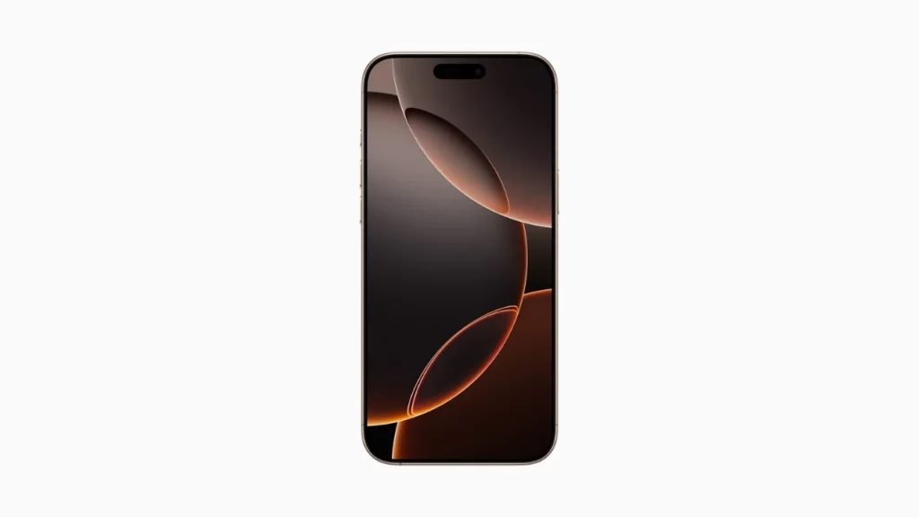
The latest iPhone 17 Pro takes things further with bold geometric patterns that almost look three-dimensional. These wallpapers stand out immediately, giving the device a unique and unmistakable identity.
Choosing the best depends on taste, but many still argue the iPhone 14 Pro struck the perfect balance between style, function, and memorability.